Showing posts with label animation art. Show all posts

Tuesday, August 11, 2015

Art & Intuition


Late June, I had finished the drawing for the painting that would become 'Fleeting Focus' (above). Then, early July my computer was temporarily being fixed and so I wasn't able to look at additional reference photos online or do color studies in Photoshop. Knowing of the approaching deadline for Galerie Abyss' 12x12 group exhibition and not wanting to wait, I decided to do something a little uncustomary and start the painting anyway with the color scheme I had in my head. Anyone who is familiar with my THOUGHTS & PROGRESS booklets can tell you this is not how I normally operate. (See below)


This is what the painting originally started to look like. (Kind of boring.) I received my computer back but then left for a needed break away and spent some time with my family. When I returned, I looked at the painting with a fresh pair of eyes and HATED IT. I sought to improve it and did some color studies. (See the final one below)
 

Now, I was getting somewhere. I had thought about the color, lighting and reflections enough that I allowed myself to start painting. Color studies (for me at least) give me a starting point - somewhere to go from and improve upon. I then completed the final painting (see below). 


You will notice the final image has some changes from the drawing and color study above. Because I gave myself more time to think about the outcome, I came up with more ways to improve it:

The last '6' of the slot has not yet come to a stop. This gave the painting more interest and a greater sense of movement. 

Red (the character from Red Hot Riding Hood, the wolf character in the painting is based off animation genius Tex Avery's wolf character of the same cartoon) was originally going to be reflected in his nose. I really liked the lighting choices I made in the color study and couldn't figure out a way to make it work because it would have meant adding another light source and altering the lighting. So I abandoned it. 

With slot machines, you see remnants of other icons above and below what the wheel eventually stops on. I dropped those elements because they were unnecessary and would have meant I would have needed to paint the numbers smaller to accommodate them.
  
All this leads me to my confession: art is not overly intuitive for me. 

 This is not an apology or an admittance of defeat, just an acknowledgement (and acceptance) of how I operate. My goal is always to make the best artwork I can, and can't successfully accomplish that by just 'winging it' and hoping it will magically work out. Some artists are (at least seemingly) more spontaneous with incredible results. I'm not one of them.

So - what have a learned from this experience?

I already have a process that works for me - that I can improve on and should not jettison.

My best effort will only come from me genuinely thinking and planning the quality of the outcome. Said another way: not being 'overly intuitive' is not a bad thing because it forces me to think about it and produce great work.

Taking a break (weather it be leaving for a week or just taking a long walk and returning) is something I shall implement more.   

Just because my computer is being fixed doesn't mean I can't do tonal and color studies the analogue way. (I just prefer digital in the planning phase because it's faster and doesn't waste materials.)

Can art become more intuitive for me over time? 

Yes. Every time I start a new work of art it's not like I have to relearn everything all over again. So there ARE things I don't have to actively think about each painting. Also, each new painting allows me to learn at least one new technique I can apply again to future paintings. (With 'Fleeting Focus', I studied then learned how to paint a convincing motion blur via the spinning '6'.)

Tuesday, June 23, 2015

'Bride of Boopenstein' - original tonal drawing

New drawing for sale on my online store. The final original drawing and tonal study for the painting cartoon monster painting, 'Bride of Boopenstein' is available here.

Other works available here: http://jonodoironstudio.storenvy.com/


"Special delivery. Directly from me to you - no middleman! I AM the king!" - Yakko, Animaniacs

Monday, June 01, 2015

Gift of Folly - complete!

THANK YOU to all who attended ART Happening Artistique's event Saturday, May 30th. Here is the final complete new painting in the show called 'Gift of Folly'.


The painting was inspired by the mystery and mythology of the use of anvils in cartoons. If not for cartoons, I greatly suspect I would have no idea what an anvil was. (Or, I would have discovered it far, far, later.) The idea for the painting sprang when I tried to place the reason why anvils became the go-to device of villainous foil. 

Turns out, nobody seems to know the answer for certain. However, I did come across this article 'Watch Out For Falling Anvils' written by Cal Meacham, who did some animation history research of his own and suggests the the use of anvils in cartoons could be inspired by 'anvil launching', which I previously never heard of. I recommend reading the article for more info. (Cal, if you are reading this, THANK YOU for writing this article - I tried searching for your contact online to thank you personally, but was unsuccessful.)

The painting above is currently still available. Please E-mail me if you're interested.

Wednesday, May 13, 2015

Tuesday, April 07, 2015

color studies and tonals - THAT LAUGH!


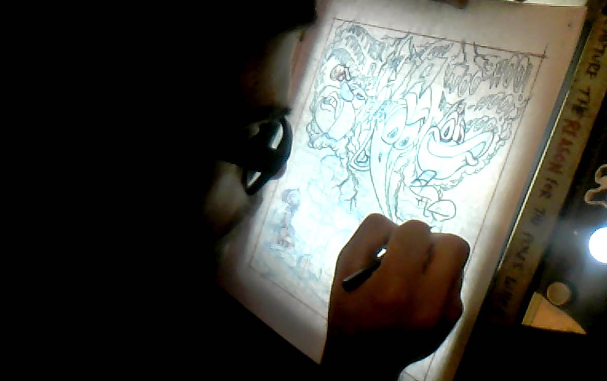
 Here are the tonal thumbnails (painted digitally) I made for the ‪#‎painting‬ 'THAT LAUGH!'. From this, the next step would have been the color studies  below. The thumbnail on the bottom left had the best balance of darks and lights.


 Final tonal study. Available here.

Here are the color thumbnails I made for the ‪#‎painting‬ 'THAT LAUGH!'. From this, the next step would have been the color study. I like to see multiple options on the same page for contrast. For the color study, I took the clouds from the one on the bottom left and Porky and Ludwig from the one on the bottom right.
The final color study. Available here.

Monday, March 30, 2015

THAT LAUGH! essay

Last month, I finally completed a painting I started last year which I had been laboring over in between other projects called: THAT LAUGH! (see previous posts). The painting is about psychological repercussions generated by some of my all time favorite cartoon characters. You can read the full story behind the idea for the painting below:


One of my strongest most undeniable influences is the LooneyTunes. Their madcap hysterics brought about more enjoyment and laughter in me than any other cartoons I can think of.  

Daffy Duck from the franchise is my favorite cartoon character of all time. Both his blitz beginnings and conceited conduct arrested my young developing mind. When I discovered Woody Woodpecker afterwards, I enjoyed his early disposition much better: a brash bird with far too much energy. Over time, I found he became heavily gentrified and his cartoons became tamer. Screwy Squirrel is a short lived brain child of one of my heroes, the late great Tex Avery.  Only appearing in five official cartoons and discovered by me while exiting my teens, the character is lesser known to many and has the most abusive antics of the three.  

These cartoon characters didn't just make ME laugh - they had prominent laughs themselves! Woody Woodpecker's laugh is indelible - if you've heard it once, you know exactly who it belongs to. Daffy's 'WOO-HOO-HOO-HOO' laugh is manic and memorable. Screwy's laugh is not as renowned - but certainly taunting. The idea of combining the three of them into a homage painting united by their wacky laughter sat in my conscientiousness for over two years before I would begin the painting. 

But the laughter these characters generated in their cartoons was always at someone else's expense.

 
Far later in my development, I realized Daffy Duck, Screwey Squirrell and the early Woody Woodpecker were not just pests - they were bullies.  Each of them exerting a combination of physical, verbal or psychological abuse on their chosen victim the whole time LAUGHING while doing it.

But why do we have such vicarious desires over such disrespectful behavior in the first place? The answer I believe is because cartoon characters exemplify our inner selves. They perform acts we would love to do - but could never get away with. It's important to note, behavioral traits (both good and bad) in cartoons characters are inspired by real people.

As much as I admired Daffy, Screwy and Woody's frantic antics, I developed a sense of sympathy for Porky Pig. In cartoons, he would frequently appear timid, ambivalent and taken advantage of. I also think the act of being bullied, is something generally everyone can relate to. Perhaps on both sides of the spectrum. (Myself, I admit, there are times I wasn't exactly an angel to my sisters growing up .)
 Many an animated cartoon would end with a character literally 'going crazy' - in some cases even incarcerated -  by the antics of another.  In the painting, Porky has been driven to the point of madness where he now must seek help from his abuse. The act of confessing maladaptive struggles to a psychiatrist was nothing unfamiliar with me either. Myself, having undergone therapy sessions on two separate occasions before the ripe age of sixteen.


 A conversation in late July 2014 with one of my best friends and concept artist, Tony Mitchell, reminded me that pink is the official color of anti-bullying. This sprang from a campaign started by two males while in High School (coincidentally from my province of birth and development, Nova Scotia) who organized a pink shirt wearing rally in support of a younger student bullied on his first day in school for wearing a pink shirt to class. With that information, I thought it would be appropriate to work the color pink into the image somehow. Porky is already  a pale pink - so that worked out conveniently. His three oppressors in the clouds are cast by an eerie pink light and their taunts at full spectrum. Also, Ludwig Von Drake (who plays the psychiatrist in the painting) dons a pink shirt.   

I think both cartoons and psychology have interested me because cartoons have influenced the behavior of generations of children in ways no one ever really intended. I've forged not only a sense of desire and empathy for cartoon characters I grew up with, but some of my fondest memories to date. Perhaps there's something very unsettling about that. I've  accumulated real world emotions over characters that don't even exist. There is a part of me that tries to battle the reality of knowing I can never actually meet them. And for me, painting them is an act of spending time with them.

-Jono Doiron
 

Wednesday, March 25, 2015

'THAT LAUGH!' - color study & tonal study

Both the color study and tonal drawing to the painting 'THAT LAUGH!' are now available on my online store. If you would love to own a piece of the development, and an original at an affordable price, this is a great way! https://jonodoironstudio.storenvy.com/

 'THAT LAUGH!' color study:
-acrylic on illustration board
-8"x10" (image dimensions: 6.75"x8.25")
-signed and dated in graphite pencil on lower right corner. 
-Title and color study stated in lower left corner
-includes a certificate of authenticity

'THAT LAUGH!' tonal study:
-graphite on off white acid free archival paper
-9"x12" (image dimensions: 8.25"x9.75")
-signed and dated in graphite pencil on lower right corner.
-includes a certificate of authenticity
buy this drawing